Keeping Shade Names Readable on Transparent Lip Gloss Tubes
Keeping Shade Names Readable on Transparent Lip Gloss Tubes
A shade name printed on a clear lip gloss tube has a changing background. The same artwork may sit over a pale nude in one product and a deep berry in another. The useful design question is whether the name remains easy to identify across the filled range, rather than whether it looks attractive on an empty tube.
Compare the name against the formula behind it
Contrast depends on both the lettering and the visible background. Dark lettering may stand out against a pale fill but become less distinct over a darker shade. Light lettering can have the reverse problem. A metallic treatment adds another variable because its appearance changes with reflection and viewing angle.
Review the proposed lettering on filled examples from the range, including colors likely to give it the least contrast. Keep the artwork, lighting and viewing position comparable while changing the fill. This makes it easier to see whether a readability difference comes from the background rather than a different presentation.
Give the words a controlled background
If one ink color cannot work across the range, a defined print panel or label area can give the shade name a more consistent background. A border on its own does not make the area opaque: the treatment behind the letters must provide the intended separation from the formula.
A second possibility is to place the shade name on an opaque part, such as an appropriate area of the cap, while leaving the bottle clear. That location should still identify the right product if caps can be exchanged. A repeat identifier on the bottle or base can help retain the connection between the name and the contents.
Check the available face, not just the artwork file
A design that is readable at screen size may need adjustment on the physical pack. Examine the longest names as well as short ones. Keep important lettering within the face that can be seen comfortably, and leave space around it rather than placing the final letters close to a corner or strongly curved edge.
The assembled cap, label edges and changing fill level can affect the view. A clear area near the top is not necessarily a permanent blank background once the pack is handled. Confirm the selected location on a filled, closed sample and at the orientations in which the name should be read.
Review the range together
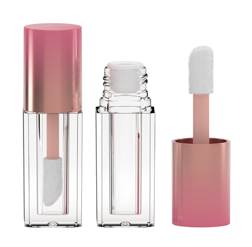
This empty lip gloss pack illustrates a possible print surface. The image does not show a completed shade-label trial.
Sambound offers empty lip gloss packaging and published printing and finishing options. Its product and customization information at sambound.com provides a starting point for discussing a model’s usable artwork area and the proposed treatment.
Before approving the design, place the filled shade range side by side with the agreed lettering, background treatment and identifier location. Check the name on the assembled pack, not only on separate components. If a particular shade needs a different ink or panel, keep the size and position consistent so the range still reads as one family.
The result should be a shade identifier that remains clear in its actual setting: the chosen tube, the intended fill and the complete printed pack.
sambound.com
SamBound New Material Technology Company Ltd.
